IKEA is one of the worlds largest furniture retailer, and since it’s close to my heart (Go Sweden) I wanted to make my own design of their homepage. My goal is to overall create a better experience for all of its + 1.6 billion users.

Ikea redesign
A multinational retailer known for its affordable, flat-pack furniture and modern, functional home goods.
Re-design
Webdesign
Company
IKEA
Task
Website re-design
Tools
Figma, Adobe Illustrator CC, Adobe Photoshop CC
Overview
Challenge
With previous studies and best practices in mind, I desided to create a more intuitive, modern and simplified design that speaks better to the users than it’s current homepage while still enabling IKEA to stay true to its brand. So, the main focus of this redesign will be to:
-
Design a friendlier first experience
-
De-clutter the homepage
-
Consistency within the websites
1. Design a friendlier first experience
We already know that people make snap judgments and that it only takes about 50 milliseconds for users to form an opinion about the website that determines whether they will stay or leave. The first two images represent the current front page of IKEA, but from different countries (which for some reason, makes them look entirely different).
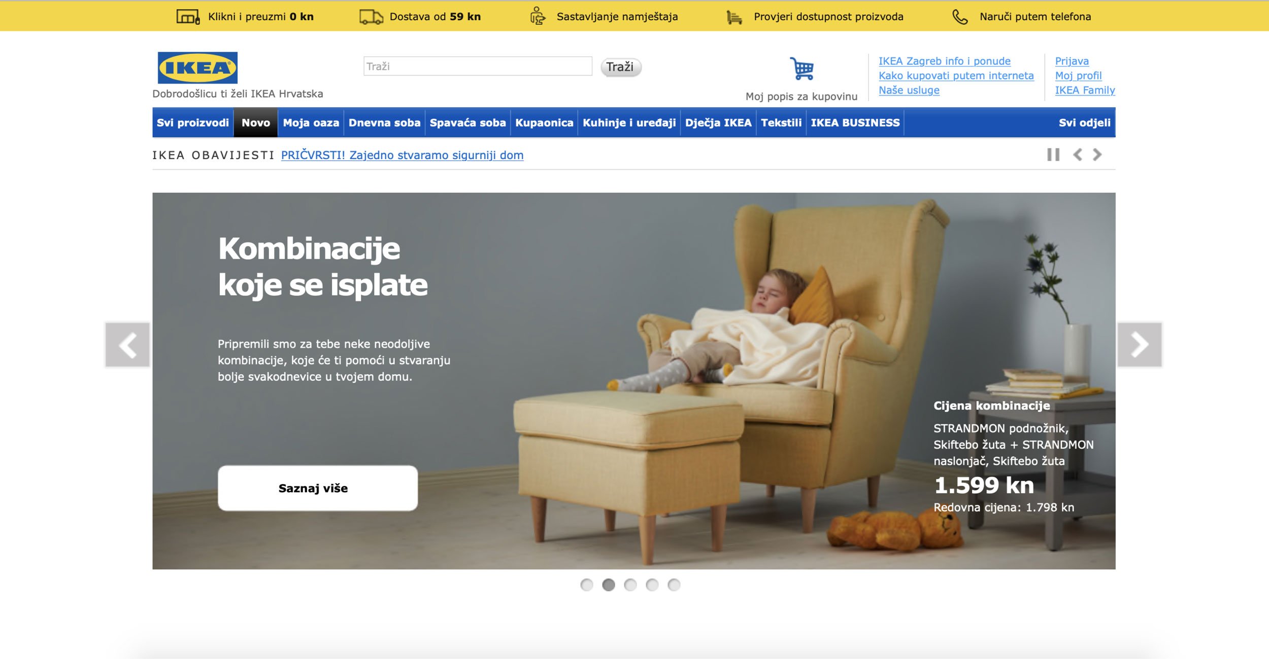
Many countries, including England and Croatia, still use this outdated version of the website. Other than looking outdated, the website is busy and confusing, does not navigate the user and is not visually attractive. Now, let’s see the Swedish version.

This is the current Swedish website. The logo does not fit in with the new design and the overall feeling could be more inviting. It’s a big improvement compared to the previous example, but is still not using all of its potential to make a great user experience.
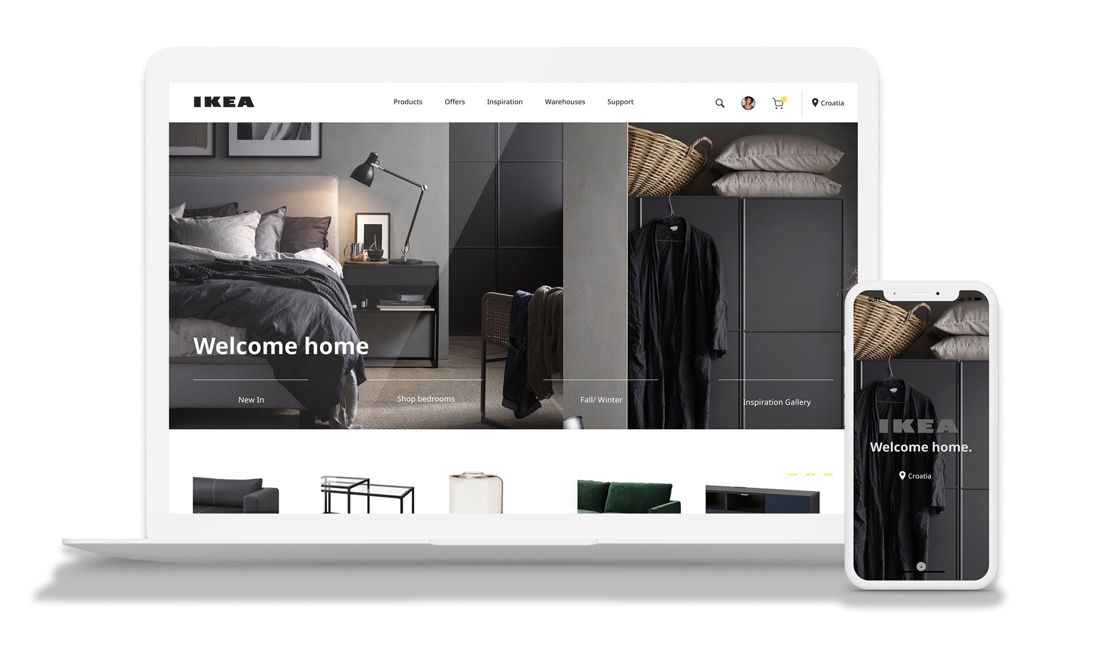
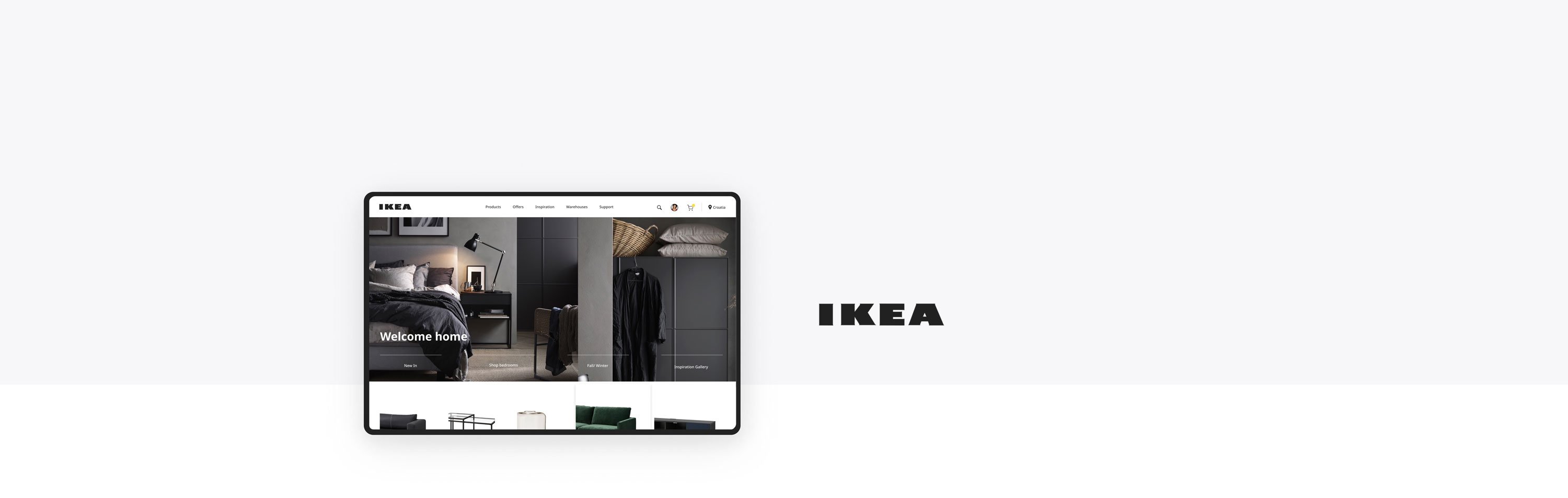
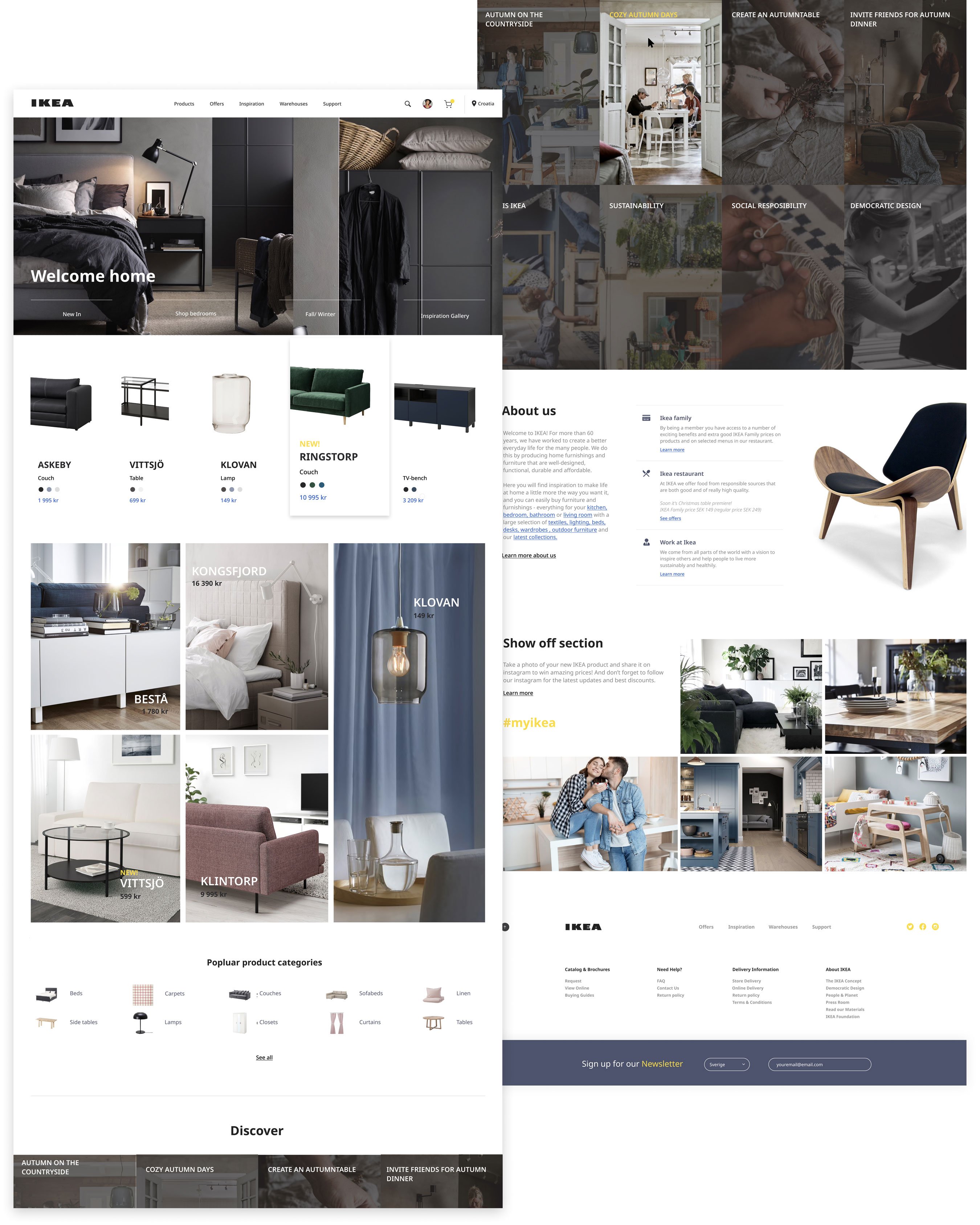
This is my suggestion. Sharing a lot of information without being overwhelming and using a background that inspires visitors to experience the site in its fullest. See my design process below.
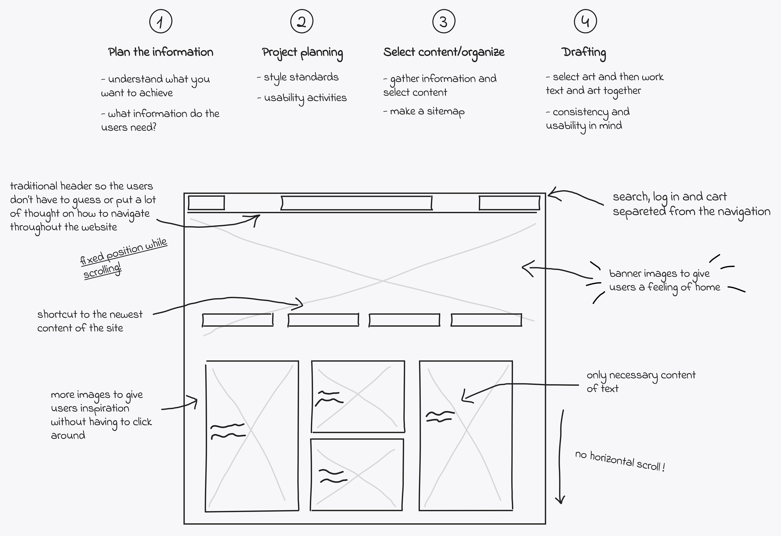
Information design process
I tried to narrow down the content and present the data in a accessible and easy way. My goal is to create a more organized and simplified site that the users can quickly grasp and understand.
2. Declutter the homepage
Consistency
Website design that lacks consistent branding can be stressful and confusing. To keep the company true to its brand, the colors yellow and blue are used for highlighting purposes, but not primary colors. The same font is used as the current website, Noto sans.
Easy Navigation
According to previous studies, 88% of websites have their main navigation located in the header at the top of every page, which is considered a web design standard. Since the homepage is the first experience for the user, I wanted to make sure that it had the highest accessibility. Therefore I placed the most important information in a standard header, main navigation which contains 5 menu options, a search bar, contact information and country.
Social Media
Since we all know the power behind social media, an Instagram section was added to the content to promote the brand further and catch the users interest. I chose to put the social media links and information on the bottom of the website, as in the footer, clicking on any of these icons takes the visitor to the social media site. For this reason, this design element that can cost the website traffic and increase the bounce rate. According to Lyfe Marketing, 72% of the websites include icons for social media in the footer and only 26% use it their header.
Quality images
Studies have shown that the users usually scan through the website and do not focus a lot on the content. Since IKEA's homepage has a lot of content, high quality images will help the users gauge the content more easily.
3. Consistency within the websites
Problem
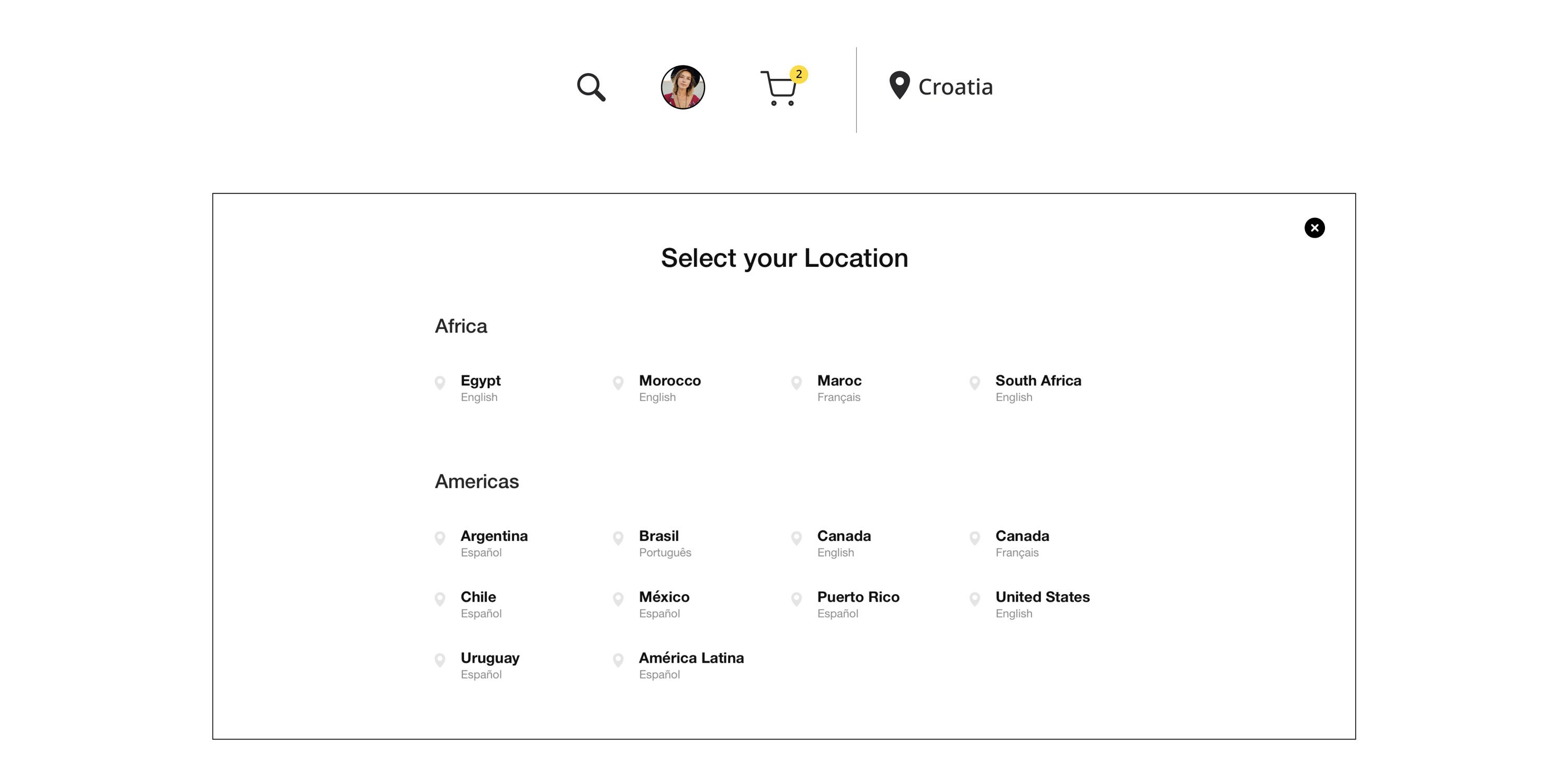
The inconsistencies of the websites depending on what country the user is in makes the user experience unpredictable and the websites that are outdated can give the user a less appealing impression of the company.
Solution
Like in other companies that have users from all over the world (ex Nike), the user can choose country within the official site. This way, the consistency stays and the company can stay true to it's brand and updates worldwide.
Reflection
This is the age where an innovative and intuitive digital experience of a brand will set it apart from being good to great. IKEA is one of the worlds largest furniture retailers, providing well designed and reasonably priced products to people, inspiring them to a better quality of life. My design was based on best practices and previous studies to make the user experience even better.
However, the inconsistencies of the websites depending on country makes the user experience unpredictable and the websites that are outdated give the user a less appealing impression of the company. My solution was that the users had the option of choosing country and language in the header. It is not difficult to design, but the development and the functionalities would have to change for the solution to work.