Tangem
Clarity in Crypto: How I Helped Tangem Transform Complex Tech into Everyday Design
Branding
Card Design
Package Design
iOS & Android App Design
Company
Headquarters
San Francisco
Role
UI/UX Design
Timeline
2020- 2021 (Full-time)
Website
Links
Overview
When I first joined Tangem, I entered a space where advanced microchip technology intersected with one of the most complex industries - cryptocurrency. Tangem’s smart card allowed users to store digital assets securely on a slim, durable plastic card, essentially turning a phone into a hardware wallet.
However, there was a challenge: the technology alone wasn’t enough. Crypto remained intimidating for most users, and Tangem needed a design that helped people feel safe, confident, and in control. That’s where I stepped in.
The Challenge
Crypto can feel like a foreign language. Wallets, private keys, blockchains — for many, these terms are barriers. My mission was to bridge the gap between complex technology and everyday people, to design a product that felt natural to use, even for someone brand new to crypto. I wasn’t just designing screens. I was designing trust, clarity, and a brand identity that could carry Tangem into the hands of users around the world.
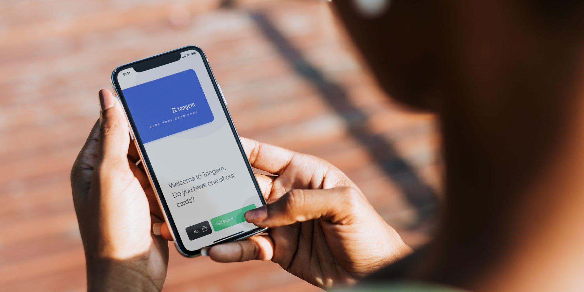
Designing the "Tangem Tap" App
One of my biggest challenges was to redesign the mobile app. Working hand-in-hand with our Head of Mobile Development, we stripped away unnecessary complexity and rebuilt the experience around simplicity. I created design systems rooted in Apple’s HIG and Google’s Material Design, but tailored them so Tangem’s app looked and felt consistent on every device. Every button, flow, and interaction was tested against one question:
“Would this make sense to someone new to crypto?”
The result was a cleaner, friendlier, and more intuitive app - one that gave people confidence in managing something as sensitive as their money.
Designing Tangem Cards & Packaging
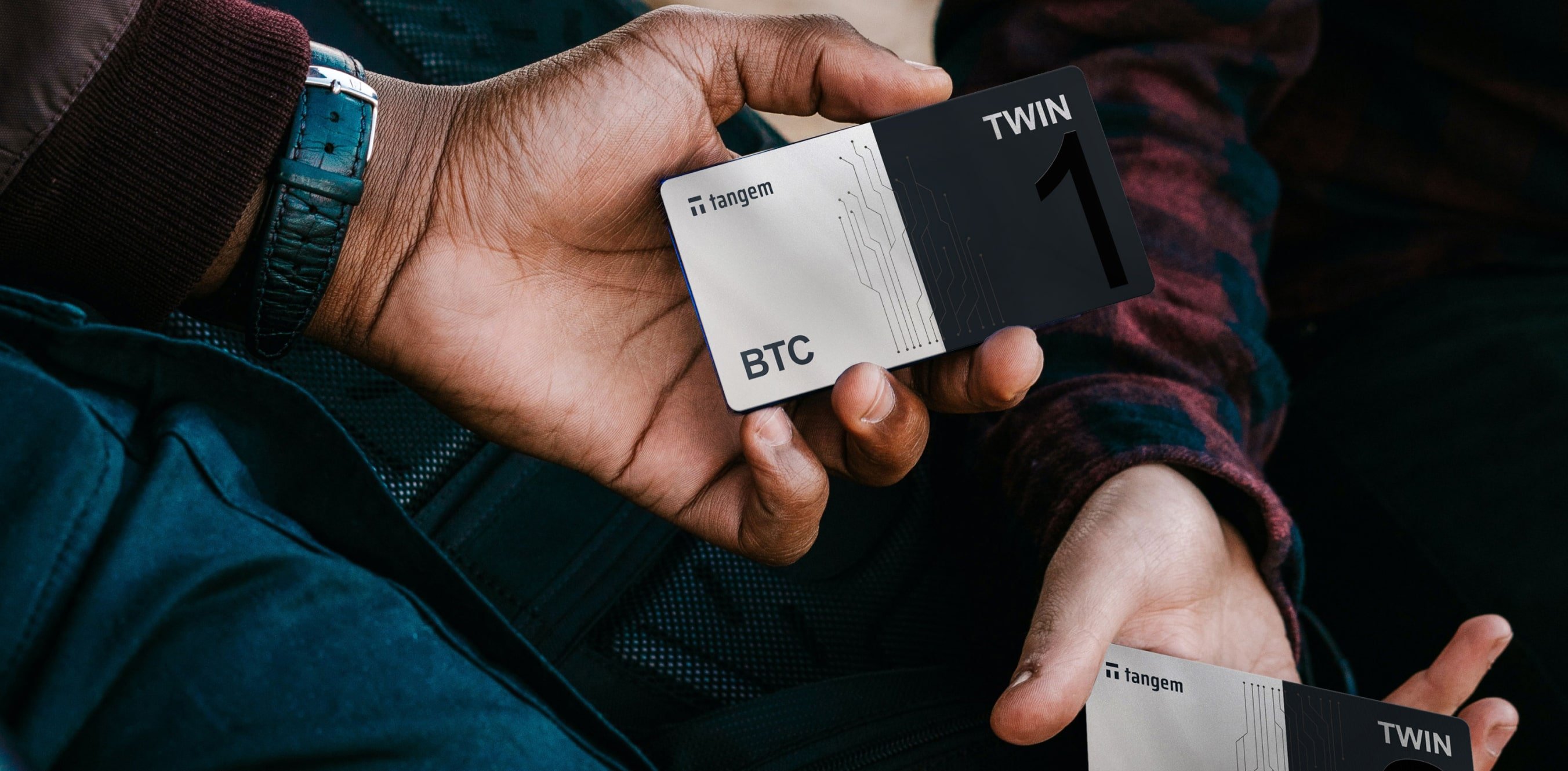
If the app was the digital face of Tangem, the cards were its physical soul. Each Tangem Card is a cold wallet: a secure piece of hardware designed to store cryptocurrency.
I was responsible for the visual design of over 50 unique Tangem cards, both for our own products and for collaboration partners. The goal was to make each card feel reliable, modern, and premium. I also worked on the packaging, ensuring that from the very first unboxing moment, users felt reassured and excited.
Building a Consistent Brand
Great products need more than good design - they need a cohesive identity. I created a branding system in Figma that unified our apps, cards, and marketing materials under one clear visual language.
This wasn’t just about logos or colors. It was about giving Tangem a voice: professional but approachable, secure but simple. I worked closely with our marketing team to create visuals for social media, campaigns, and announcements, helping Tangem grow its presence and connect with a wider audience.
The outcome
Through this work, Tangem transformed into more than just a tech company. It became a brand that people could trust.
- The app redesign made crypto management simple, even for beginners.
- The card designs and packaging gave the product a tangible, premium feel.
- The brand system ensured Tangem was consistent, recognizable, and scalable as it grew.
- Most importantly, we made crypto feel human. What was once intimidating became something you could carry in your pocket, tap on your phone, and use with confidence.
Reflection
Looking back, what excites me most about my journey at Tangem isn’t just the design systems or the number of cards I helped create. It’s knowing that I helped lower the barrier to entry for people curious about crypto. Design, for me, has always been about more than pixels - it’s about making technology accessible. At Tangem, I had the chance to do exactly that: to take a groundbreaking innovation and shape it into a product that feels clear, approachable, and human.